words on stuff: loose notes from the rabbit hole
i'm off for summer break. so as not to break with longstanding tradition, my life and schedule and habits have to varying degrees descended into chaos and turmoil.
last time i had a long break in january, i started working on a card game i've been noodling with on and off. a big component of it is that cards are handmade by players, so i started playing around a lot with how i write on the cards, which has kind of in turn carried over into just how i write on stuff in general.
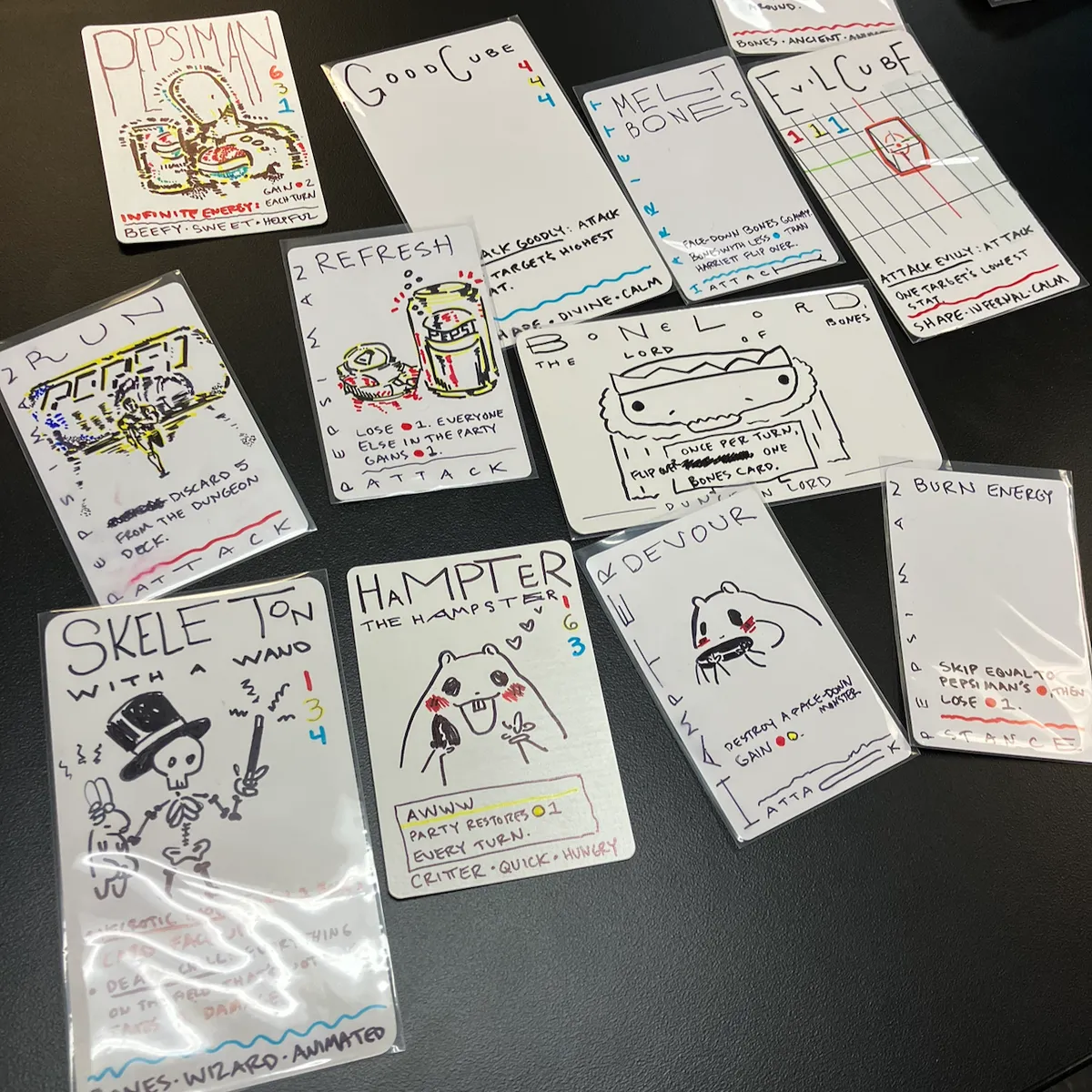 (the only drawing i did here is the wide skeleton, the rest are by my students sarah and scott. i started making the game by just making cards, usually with my students, without worrying about what the rules are just yet.)
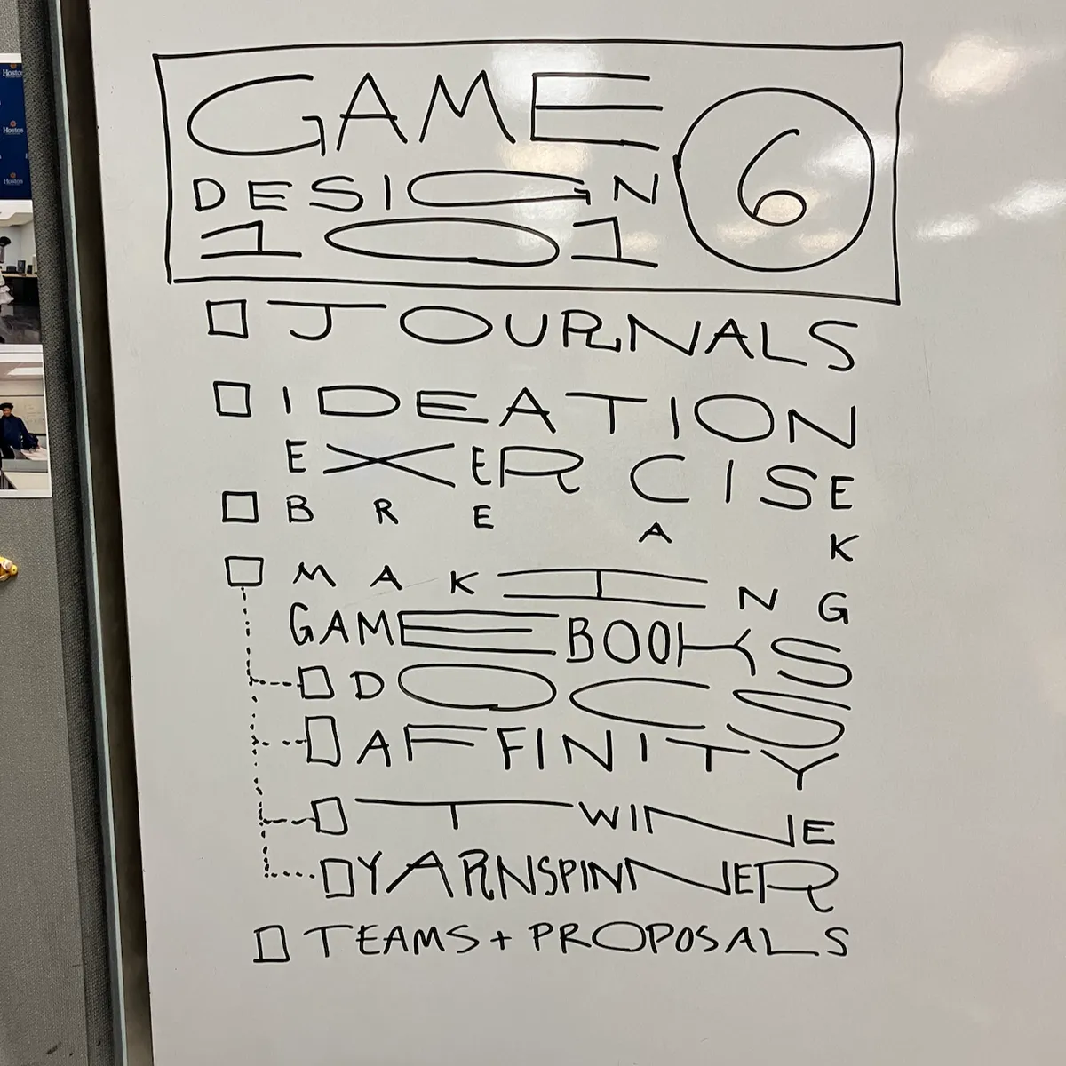 (writing out the agenda A Little Fancy at the start of class ended up becoming one of my favorite rituals.)
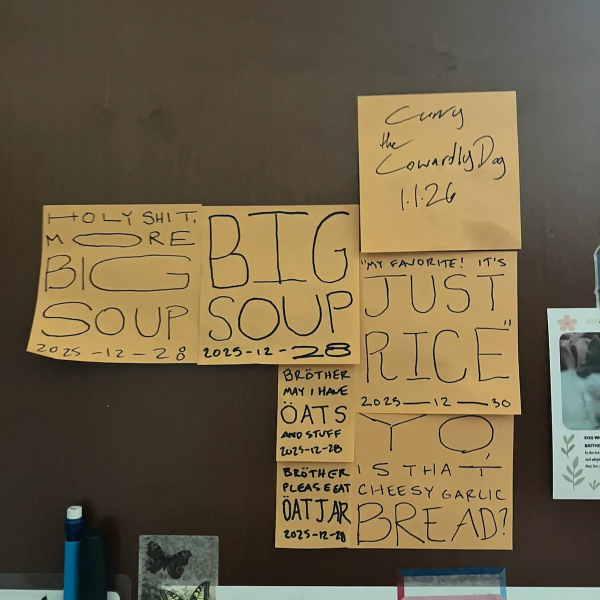 (i think you get it, i just wanted to include my partner's curry pun.)
predicting summer chaos, i signed up for three japanese classes over the summer to give me a little bit of structure. since i was thinking more about how i write things, i also thought it might be interesting to take a brush calligraphy class. (i was correct.)
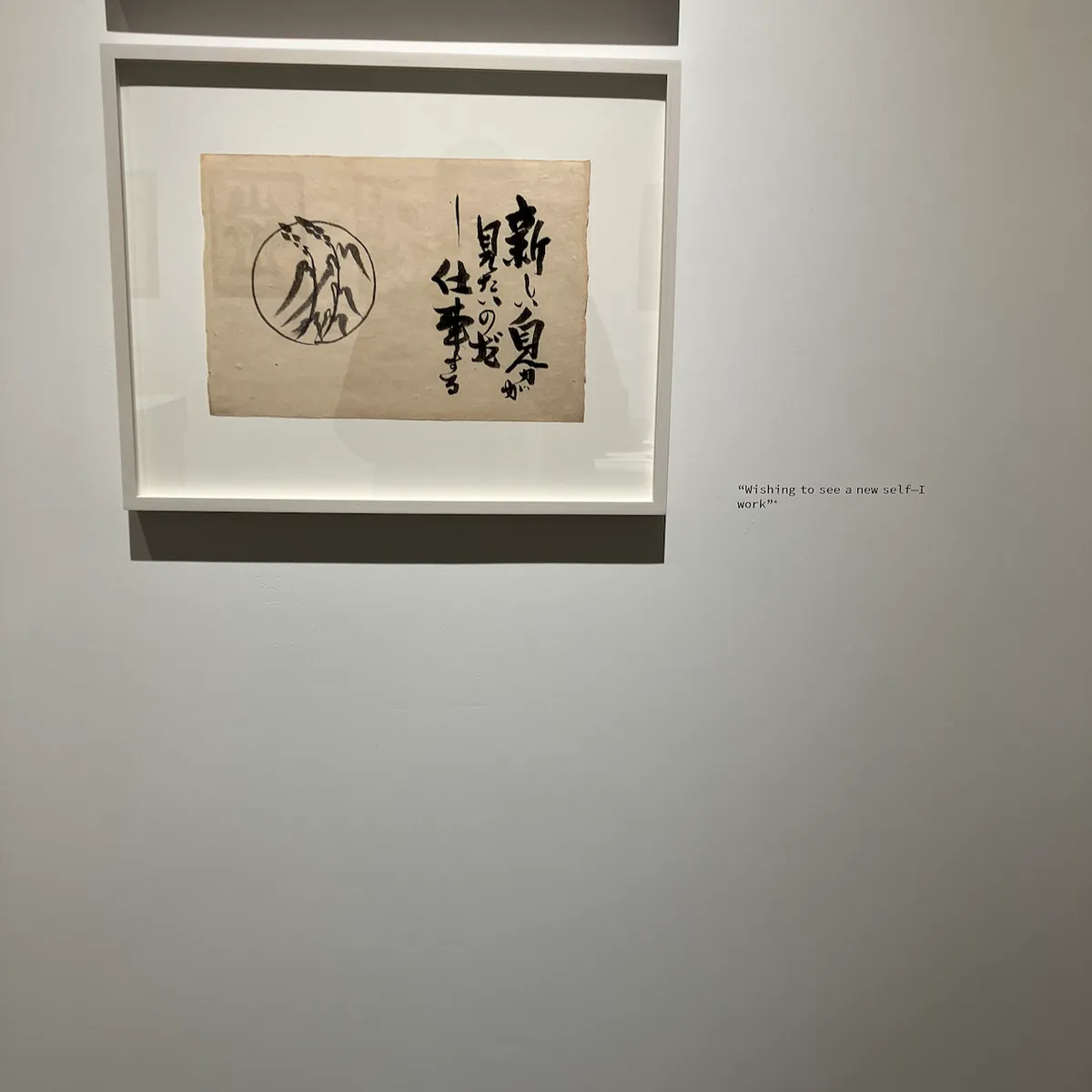 (from an exhibition of kawai kanjirō's work)
separately, mostly, i've been reading a lot of manga, which maybe contributes to my summer delinquency. i've been going through the library to save money and space on my bookshelves. (the latter is probably more the deciding factor.)
i don't quite remember how i led myself to it, but i started wondering what typography and graphic design looks like in japanese, and more broadly just in non-romance languages. i found victionary and sandu, which both have a lot of interesting-looking books:
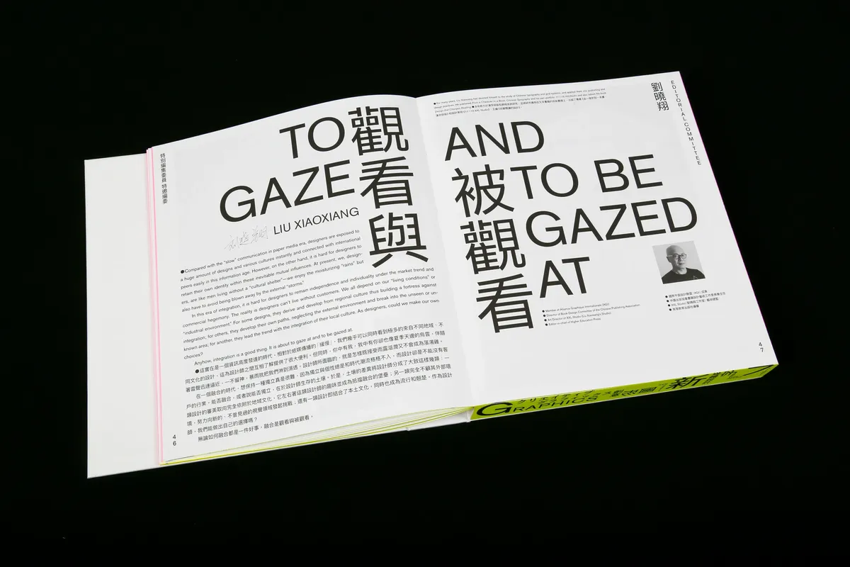
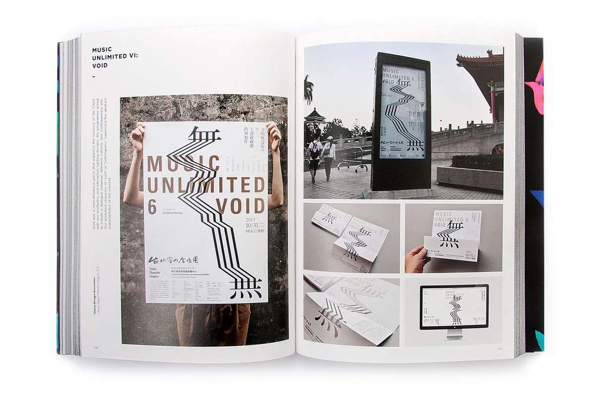
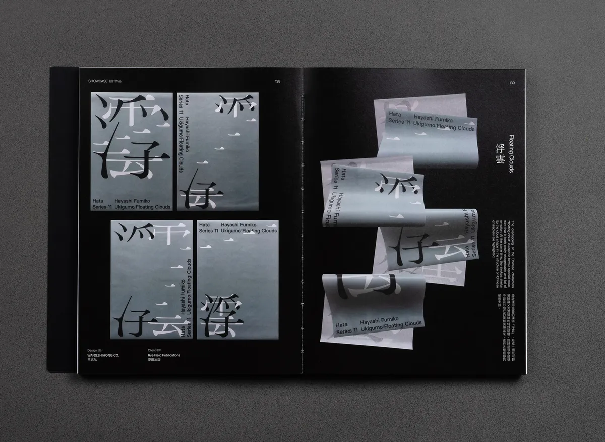
look at theeeeeeem. but: they are expensive, and out of print in some cases. being the renowned genious i am, i thought: "hey, the library is a place to get books that you don't have to pay for."
so, i spent most of tuesday sitting in a terrifying1 room in the research library. which, given the nyc heat wave and the air conditioning, could have certainly been worse.
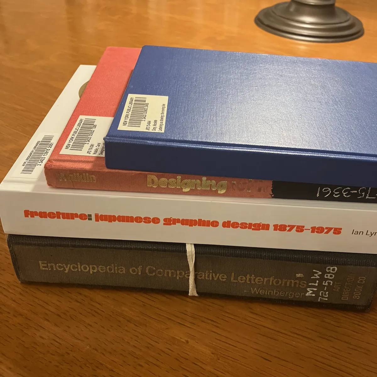 (not pictured: the other 8 books that are waiting at the reading room that's closed for the long weekend, and the other 16 books i have bookmarked for after that)
loosely, i just kind of dug up whatever i could find on lettering, typography, calligraphy, and so on. they're all kind of different manifestations of the same thing—put words on stuff—separated i think only by tools and purposes.
i meant to request scans of these, and i may later to revisit them, but in the meantime you can deal with some scattered photos i took hastily.
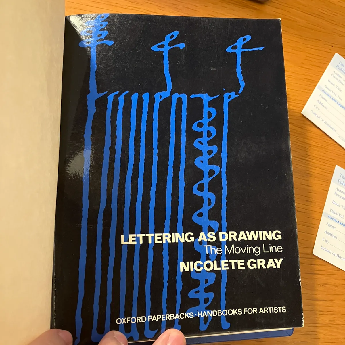
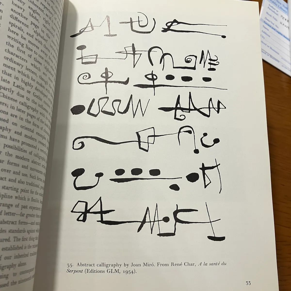
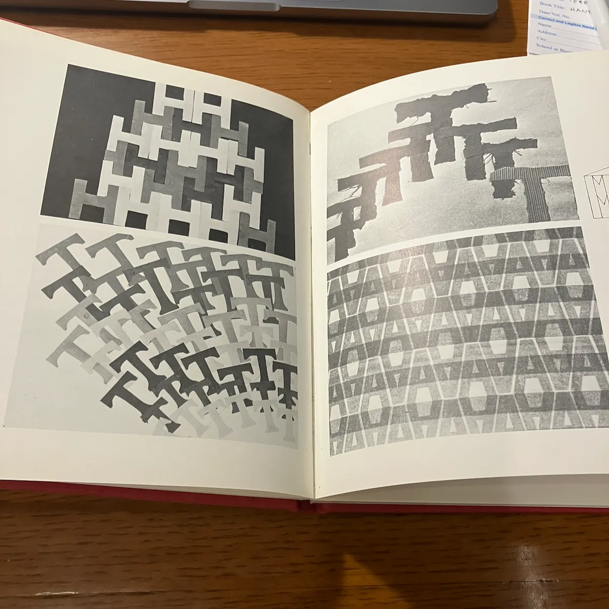
lettering as drawing: the moving line (nicolete gray, 1970)
i don't know if that many of these are that useful for my purposes, but goddamn nonetheless.
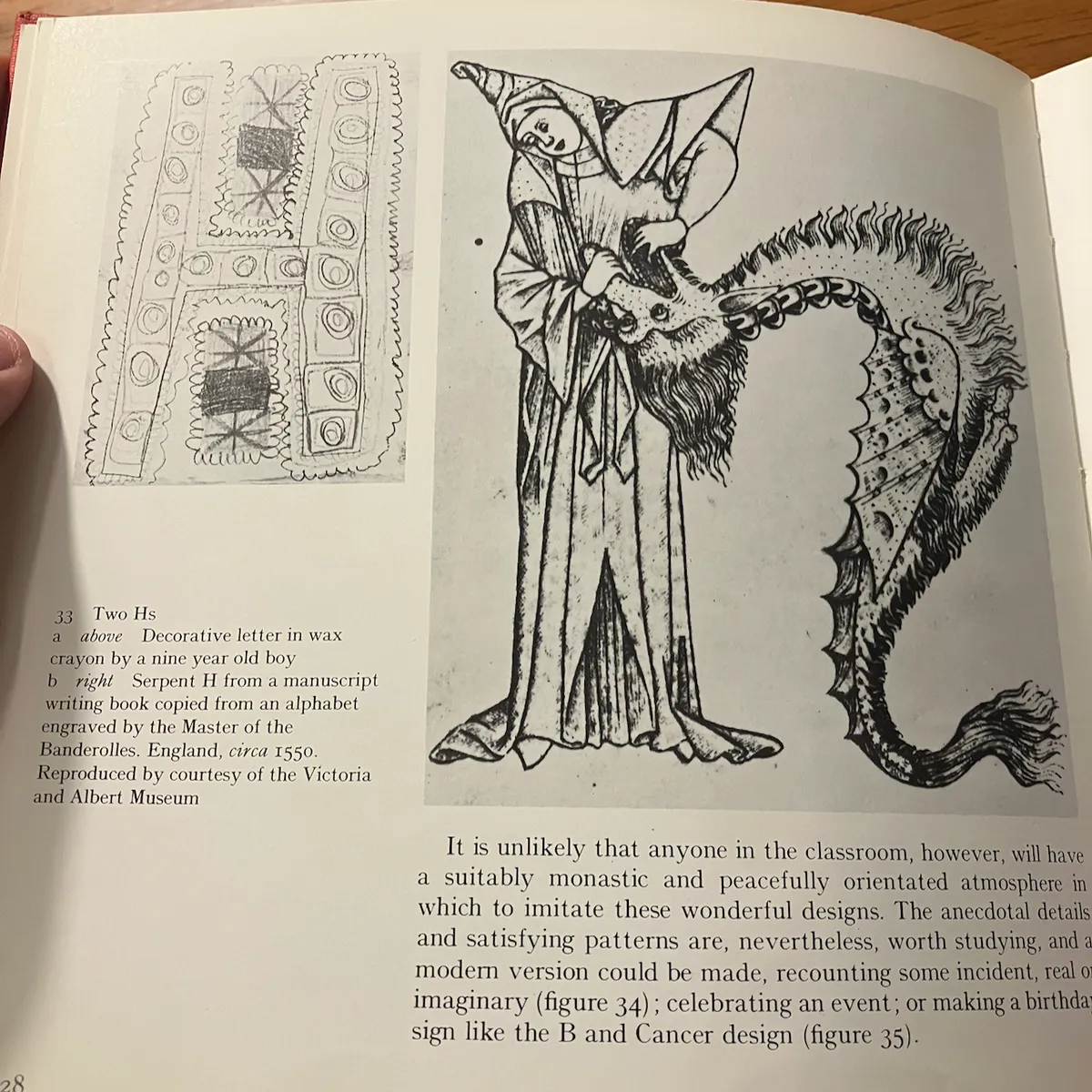
designing with letters (carol walklin, 1974)
i actually quite liked a lot of the work in this specifically because it is student work of all ages. both because these things rarely get well-documented, and because it made me go "oh, hmm!" as i'm thinking about some assignments for my programming class next semester as i work on writing a textbook over the summer.
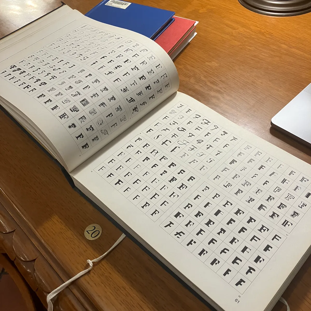
encyclopedia of comparative letterforms for artists & designers (norman weinberger, 1971)
(i have to wonder if all these early 70s books have a particular common thread to their acquisition)
this one i did not find especially interesting, as it's a straightforward font book. f's in the chat:
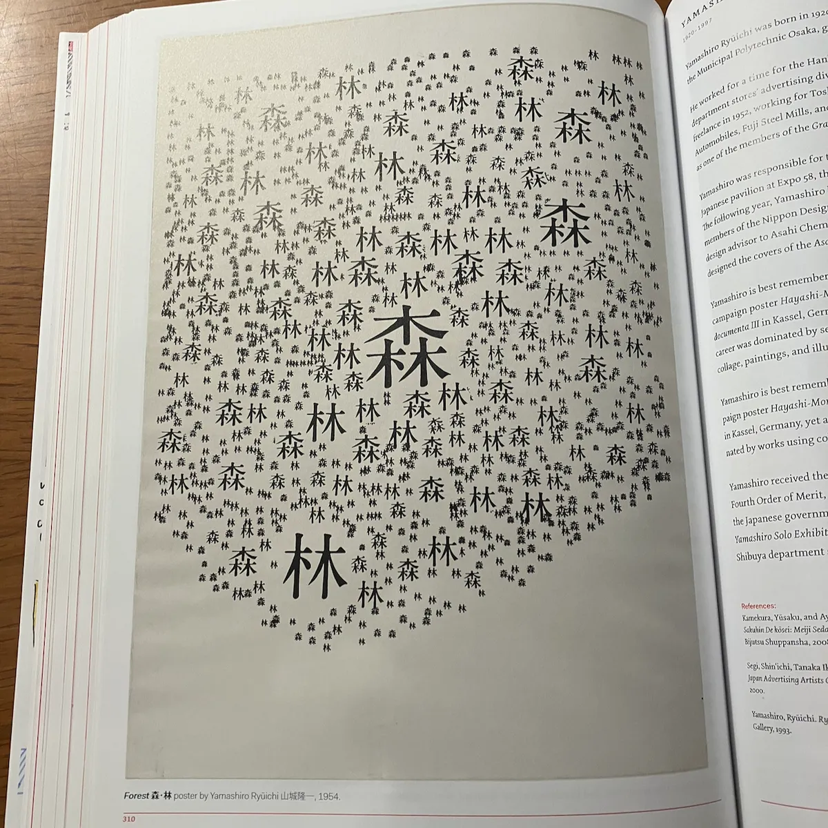
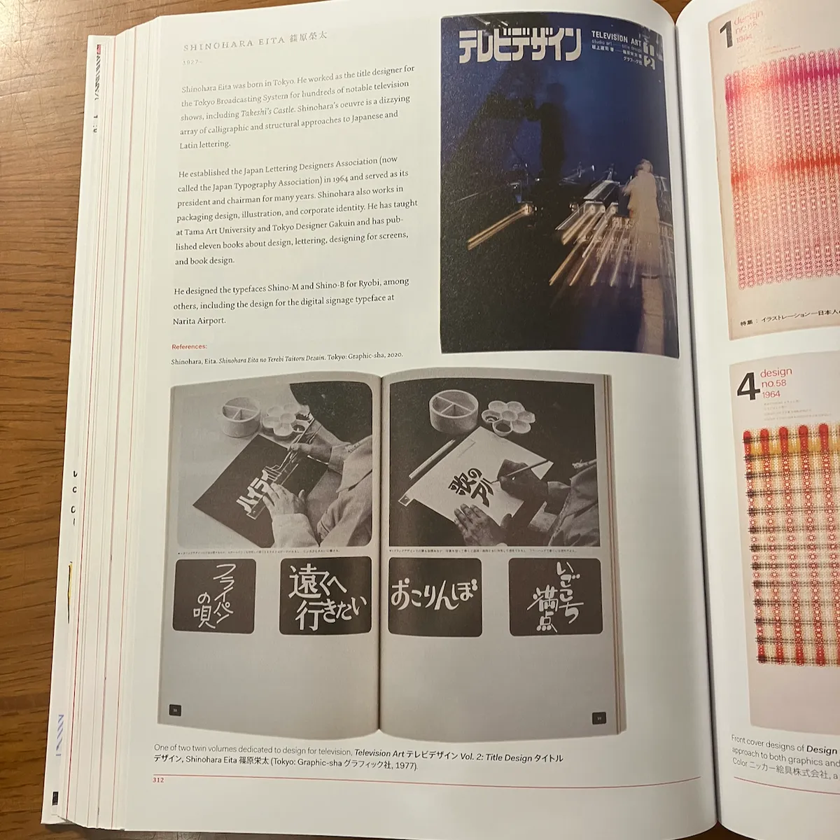
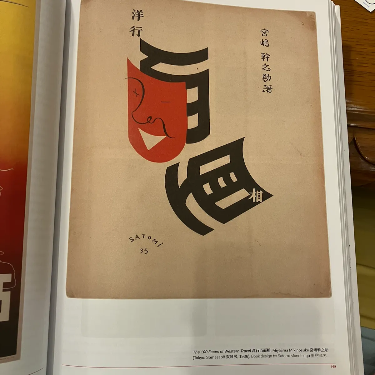
fracture : Japanese graphic design 1875-1975 (ian lynam, 2024)
i don't think i gave this one its due, as i was by this point skimming fairly quickly to make sure i could make a train. that said, this i think has a lot of amazing work throughout. the hand lettering of tv title cards of a certain era is especially amazing, and something i've always thought was neat.
i don't think these are especially relevant to anything i'm working on, but i find them delightful anyway:
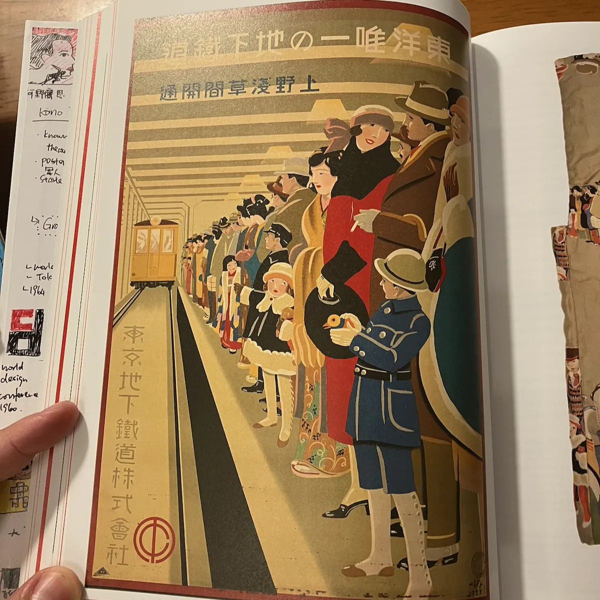
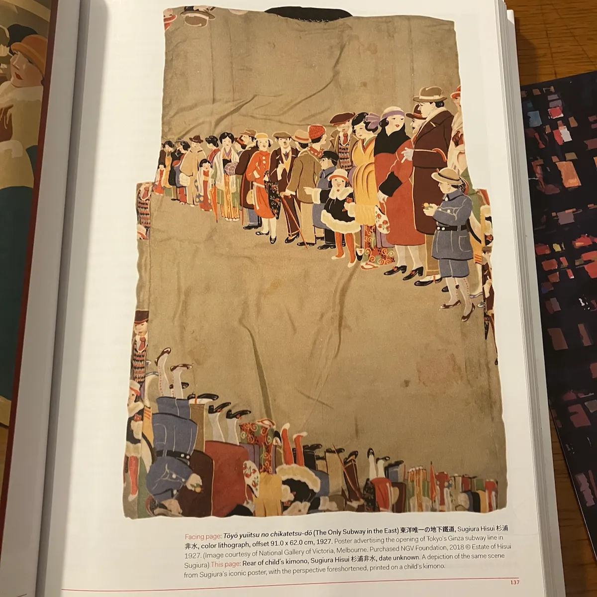
one must imagine the child who is flexing on the other kids at the festival with a subway ad recreation kimono.
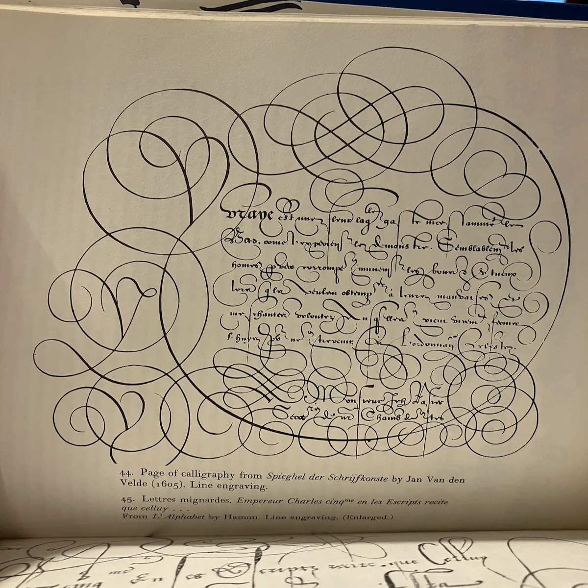
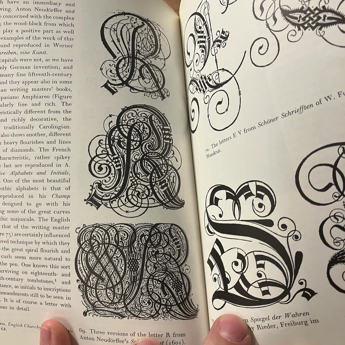
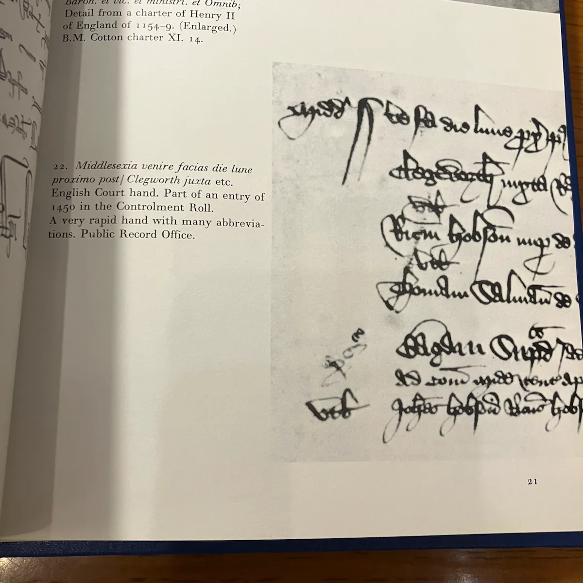
bureaucrats love flourishes
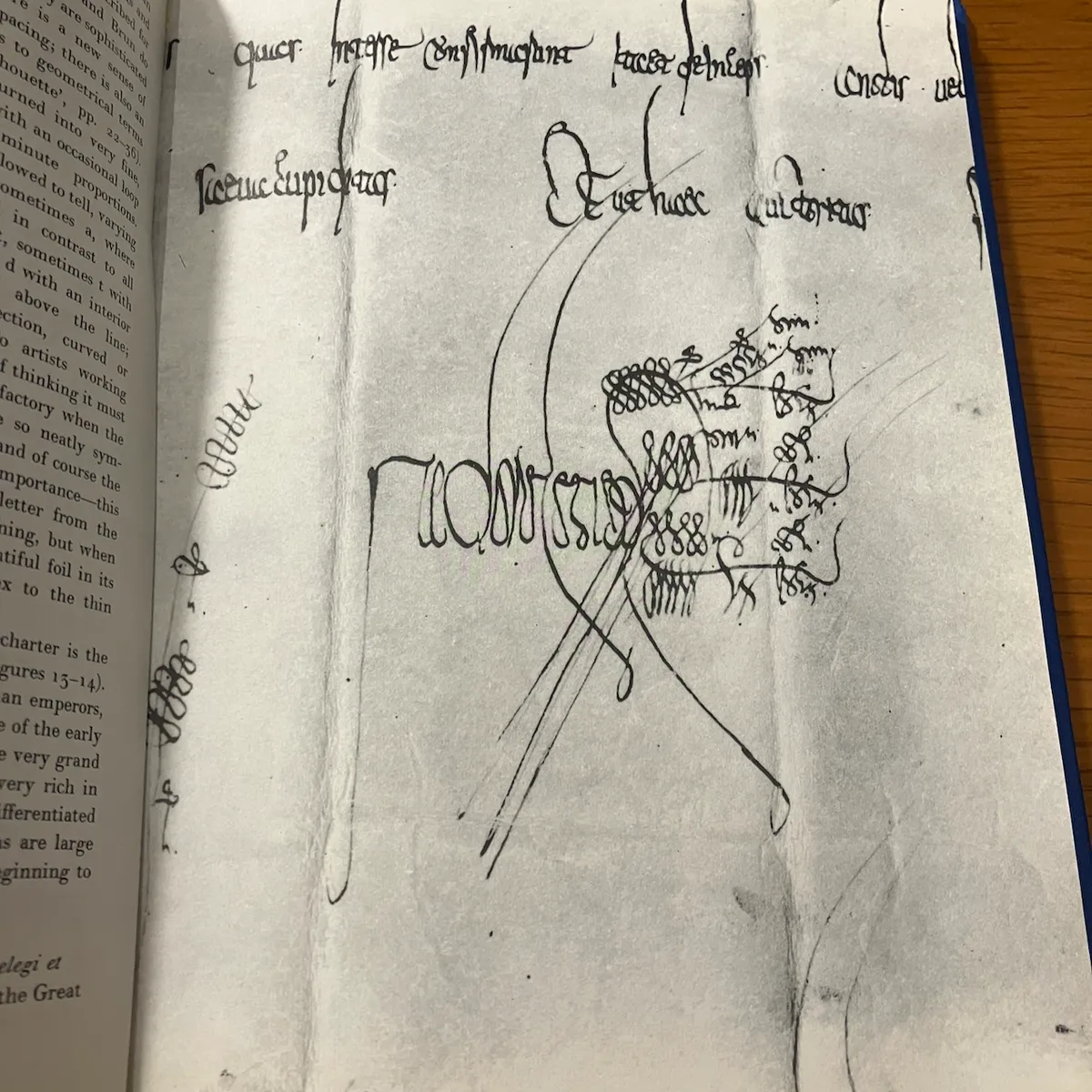
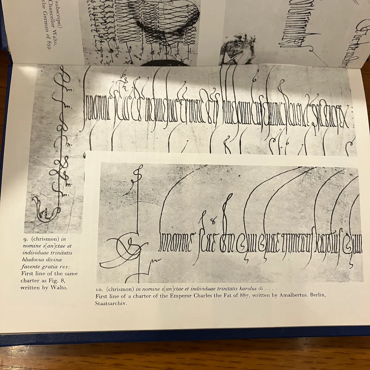
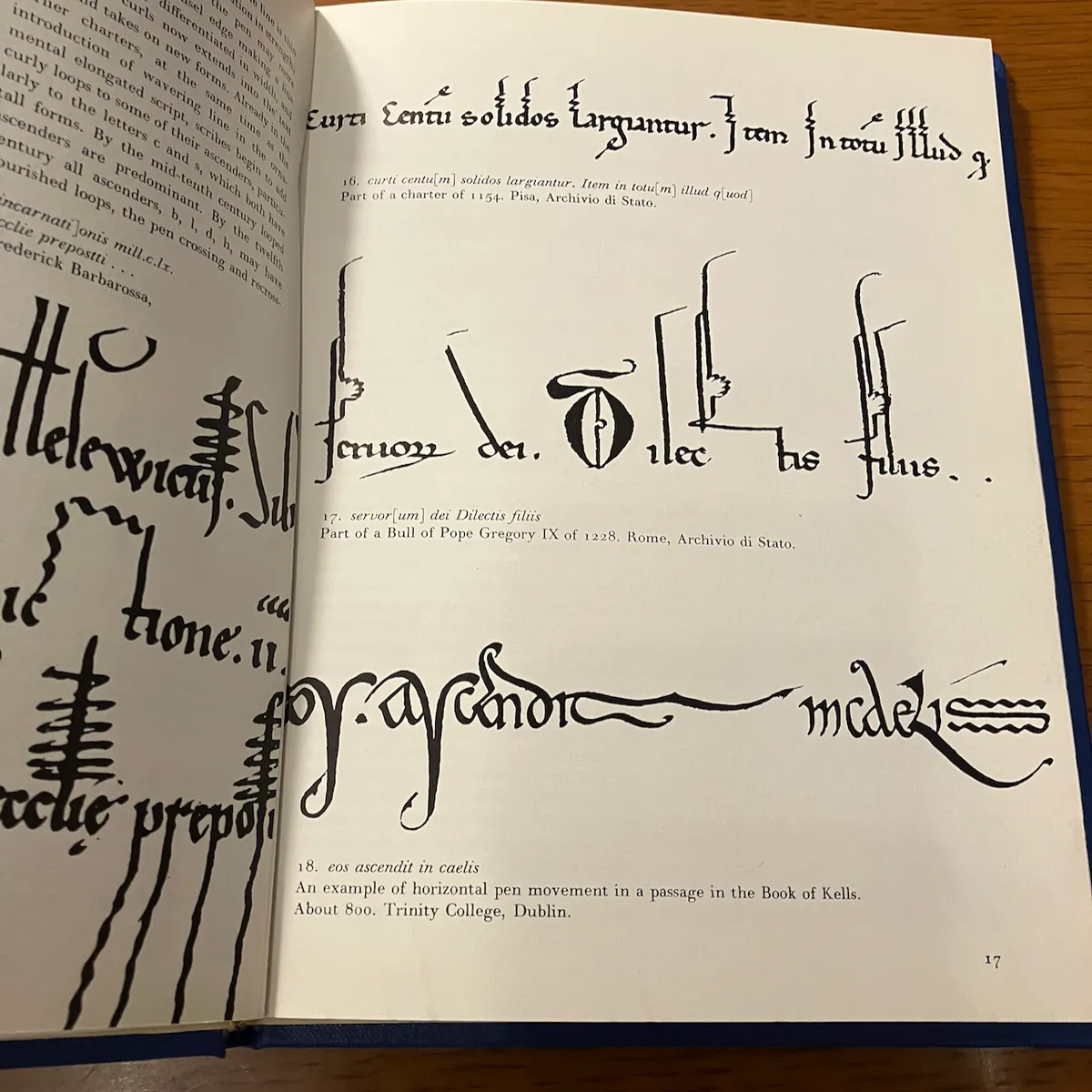
to go back a moment, this bit from lettering as drawing caught my eye:
i was idly looking up types of brush calligraphy and stumbled on an example of the clerical style of brush calligraphy from this site:
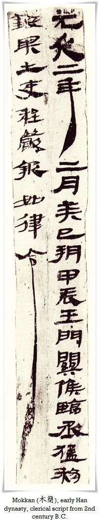
there's something curious about these two scripts by bureaucrats seeming (to my untrained eye) to have some similarities.
kashida justification
earlier today, i was checking on my rss feeds and came across this really fascinating piece about arabic typography on the web, which: first of all, what a good piece that threads so many complex topics with tremendous ease.
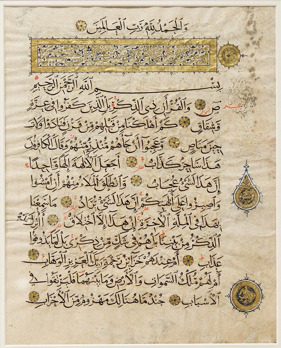
second of all, it hits on this thing of justification with letterforms instead of spaces. amazing! this whole time i'd been kind of thinking of it all as "space filling" for letterforms, not necessarily in terms of justification but just as like a fluid and stretchy thing. maybe not surprising that a few months ago i started playing around more with mesh warps on type.
an explosive ending
i don't have a well-considered conclusion or a satisfying ending. this is still all kind of ongoing, but sometimes it's useful to write it down so it's less in my head. that's blogs, baby.
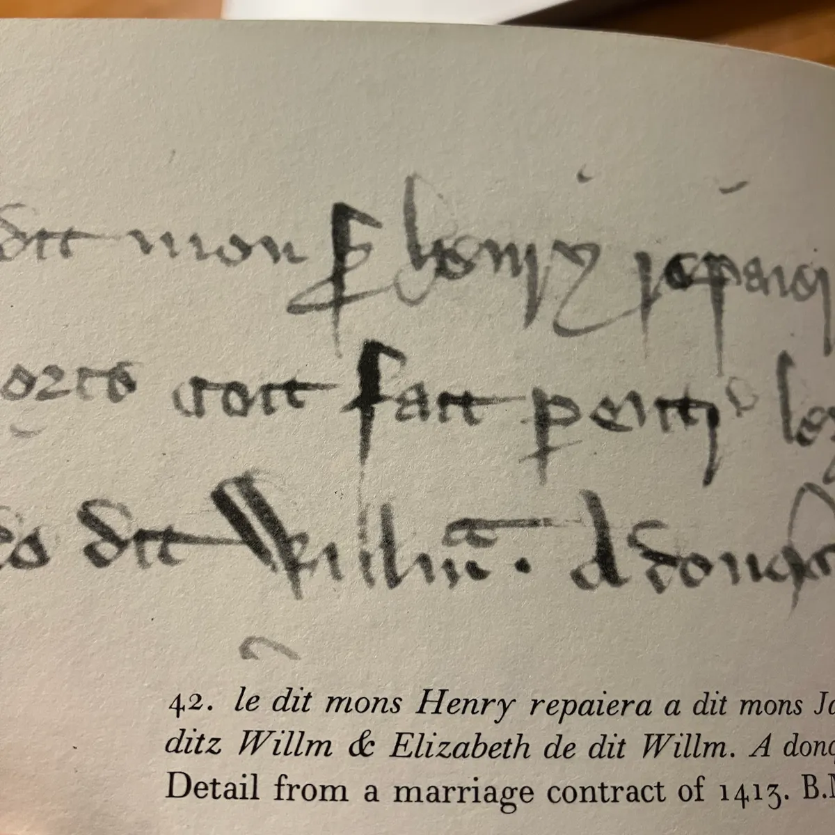
so, here's a bit of writing that looks like it says "fart," though it probably doesn't:
i don't know that it's actually terrifying, but the first time i went to the research library i immediately did all the things you're not supposed to do—ask to check out a copy of a particular translation of the count of monte cristo because you left yours at home and i mean the library is right there—and felt embarrassed.↩